Figure 2. Border around chart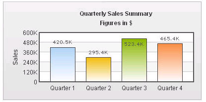
Figure 3. Canvas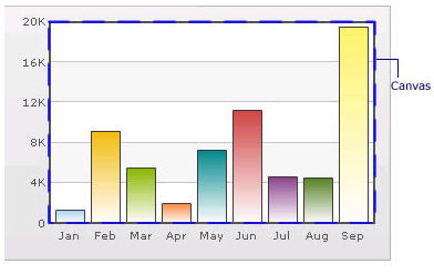
Figure 4. Data Plot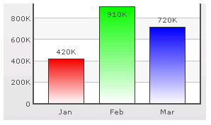
Figure 5. Data Plot with solid fills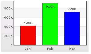
Figure 6. Data Labels
Figure 7. Data Values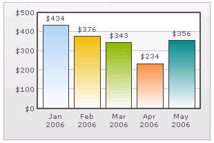
Figure 8. External Logo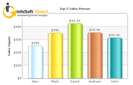
|
•
|
|
•
|
|
•
|
|
•
|
Figure 9. Division Lines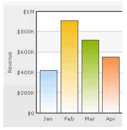
Figure 10. Zero Plane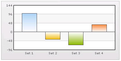
Figure 11. Anchors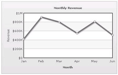
Figure 12. Tool Tip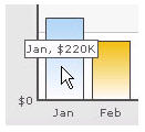
Figure 13. Paddings and Margins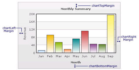
Figure 14. Smart Labels and Lines
Figure 15. Legend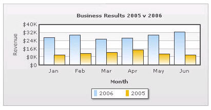
Figure 16. 3D Charts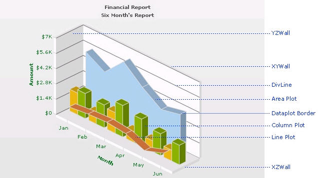
|
•
|
|
|
||||||||||||||||||||
|
|
||||||||||||||||||||
|
|
||||||||||||||||||||
|
|
||||||||||||||||||||
|
|
||||||||||||||||||||
|
|
||||||||||||||||||||
|
|
||||||||||||||||||||
|
|
||||||||||||||||||||
|
|
||||||||||||||||||||
|
|
||||||||||||||||||||
|
|
||||||||||||||||||||
|
|
||||||||||||||||||||
|
|
||||||||||||||||||||
|
|
||||||||||||||||||||
|
|
This property enables you to specify the appearance of the data series and data items in the series.